
I am finally sick of it. It would have been so much easier, and probably more fun, and certainly less stressful, to bang out one of my animal and plant multi-layered bright paintings. I cannot believe how tired I am tonight. I literally rolled out of bed and started working and knocked off at 8:30 pm. Im still not finished but any major work is over and it is all finessing and tightening up now. Win the prize? I hope I can even get in the show. I had some technical problems that set me way back. Am I sorry I tried to paint Flannery? No, and I am looking forward to another large painting of somebody -maybe Harper Lee - in the near future. So. What went wrong?

When we left off on day 5 I had not yet painted the feathers on the peacock tail. I did, and I liked them okay but they were too bright and too strong for the rest of the painting. I needed to take the brightness of it down and added and overlay of sheer circles and texture with a spray of droplets. I liked it better, but realized this evening as I knocked off, I need to curve that tail even further toward the right of of the board.


Fittingly, it was putting in the devils that started my troubles. I deepened the background color and free painted these creatures, drawing heavily from the Bosch style of demons:


It looked fine until I began to paint layers of sheer color over them with the idea being that eventually the devils would be taken down to a very subtle presence. But it started to rain and the paint didnt dry as fast as I was used to and when I laid the next layer down, the paint stuck to the dried areas but lifted off the paint where it was wet leaving a very unattractive mottled surface. It was so humid everything was sticky and difficult to work with. I kept trying to work around the situation but could not get the paint to do what I wanted. I dont know that much about acrylic to begin with. As an illustrator, my medium was gouache which is very different. But you cannot paint large pieces with gouache. Eventually the background got too dark and it looked horrible.

See how uneven and smeary the color looks? no matter how much I tried to match it or fill surrounding areas to even it out, the paint wouldnt stick or it would be too dark or not match. I was extremely frustrated and sat before it trying to decide what to do. Here is a close-up of the mottled background:

This is not acceptable. Not only should a painting be an interesting image, but the surface should be a thing of beauty and in some way indicate proficiency with the material. I failed on this part and made a hard decision. I scrubbed the surface with nail polish remover because it contains acetone. I was able to get most of the sticky layers off but was left with a horrific surface but at least it was able to accept paint.

This morning I woke up and scrubbed the surface again with soap and water and tried to paint around the figures and bring the background into something, if not even, at least pleasing. It didn't work and I realized I would have to cut my losses and gesso the background back to the beginning. So I lost at least a half day of work.

I tried again to work in the devils and demons and gave up after 2 hours. Then I tried to make a pattern instead by laying branches of an ash tree on the background and spray painting yellow. I waited for it to dry and it never did. Instead, it made like a powdery surface that I could just wipe off with a rag. It looked pretty though, and had it dried, I couldve layered that (it was sunny and dry today) and had a pretty background. Instead, I had no choice but to paint the background a solid color. I have a little darker tinting on the edges, but not much. Its very flat and I am disappointed.
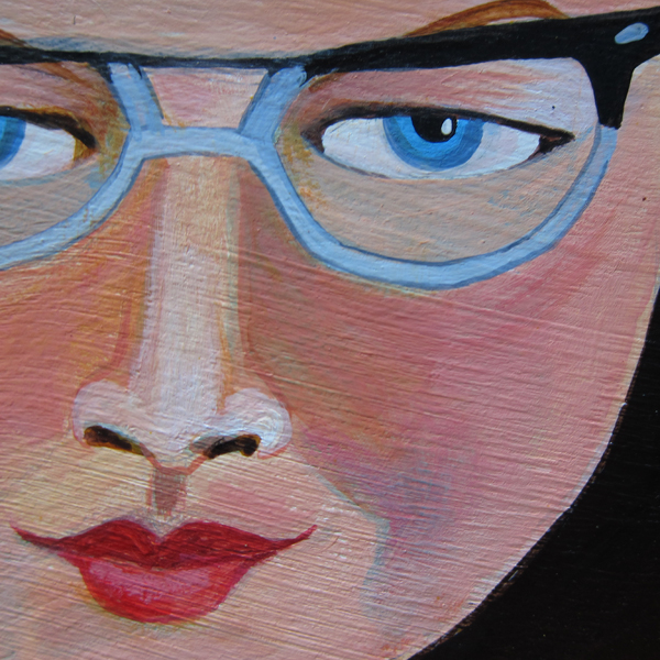
I worked on Flannery's face, arms, the peacock and tightened up some of the water. I also added the thing on the crutch that LX noticed I left off.

*sigh* I can just say it was a hard week at work. I will show you the final art tomorrow. Thanks for joining me on this journey!

Personally, I was really liking the mottled demons as shown in Pix 9. Of course, I may be projecting.
ReplyDeletelx: first, thank you for the heads up on the furelle (?) on the other crutch. nice save. Second it looks okay in a photo -but in person it was not acceptable. I couldnt turn that in. what do you think of the devils as an idea? because I bet I could mix a paint that is just slightly darker than that background and give it another shot.
ReplyDeletebtw, always say what you really think! and thanks!
I think Flannery banished the devils.
ReplyDeleteDon't know as I would argue with her.
I am not a fine artist or a devotee of O'Connor ... but Flannery's expression changed when the devils were present... not in a good way.
Now, with the devils gone, Flannery looks like herself again.
Will you leave a fan going in the studio overnight to help with the drying process? I think your intentions for tomorrow, to just add highlights, is a good plan. The color of the sky, outside the cone of Grace, makes a very powerful statement, no demons required. Good job with the tree line.
Rest well and have sweet dreams.
You are welcome. Glad that was a help and not just some pedantic kibitzing!
ReplyDeleteI really do like the demons and the lighter mottled background. Of course, I do no know about the painting materials. Perhaps there is an acceptable way to subdue the background and demon images?
Whatever you do with it, I hope it winds up with something that is pleasing to you.
I think you have done really well considering all of the setbacks you have had with the humidity and having to re-paint the background. I actually liked the plain background colour before you added the devils and I like the lighter blue above her head with droplets falling down, a heavenly touch. Would you consider lightening the backgound colour again and adding some texture or pattern, just my humble opinion?
ReplyDeleteEverything else looks fine.
Good luck sweetie, I can understand why you are so tired, you want perfection and it is draining when something goes wrong.
xoxoxo ♡
I like the tree line you added. Also like the idea of the demons, but see what you mean about the smeariness. In contrast, the new, plain background looks crisp.
ReplyDeleteI've loved following this series and seeing how the piece changes from day to day .... thanx for sharing so much of yourself with us ... xoxoxo
Oh I really love those devils. I get that you needed to cover them up, but still... they are beautiful.
ReplyDeleteYou continue to amaze and inspire me with your brutal honesty about all that you do and I hope you know this series of posts is a piece of art in itself.
xoxoxoxoxxox. I wish you lived next door.
I know zippo about Flannery...I've just read 2 of her short stories. It seemed to me with the demons that she was being protected from them by the light...and I liked that very much. I also like the droplets from above. Thanks for sharing this project with us. It makes me feel more hopeful about my own artistic efforts and trials. You are so painstaking with your work! Get some rest and things will seem better tomorrow.
ReplyDeleteWhat boxer said ... thank you for this week of honesty, beauty & truth.
ReplyDeleteFor what it's worth, my 2 cents - I liked the top photo's lighter blue section and droplets and I do think the demons in No.9 looked very much like hell. I like the contrast in mottled, patchy, scrapey looking surface & texture around devils + I think it's looks extremely hot making sense of her finding shelter & comfort in water.
As someone new to painting this is exactly what seems & IS so very frustrating about the process. I can't remember what your deadline is but I suggest a walk to the creek, plenty of deep breaths and I know you'll know exactly what's left to do. xoxo S & les Gang
Looking back at day 5 the forward to
ReplyDeleteNow. Demons as concept, good, but perhaps
As drawn are comic? Dull the demons to
Hardly noticeable, maybe justeyes watching?
The hard work and process are eye openers
For us all.
Well, I do love me some demons, but I get why they weren't working for you.
ReplyDeleteI loved the droplets. For me, the background seems too dark now? Or maybe I was just loving the orange against the blue. I think there needs to be something in that background, to break it up a little. Lighter tendrils? Or demons. ;) You'll figure it out. I hope you have a nice dry day today! xox
That little stand of trees in the far right background—love that touch. A literal and figurative oasis and it's amazing the sense of space it added to the piece.
ReplyDeleteAs for the demons, like XL, I liked the way they looked initially, but now I totally understand your problems with them. And there's something so soothing about all that blank red, but I don't suppose you can just leave it that way.
I know well that tight-stomached feeling when you're trying to make something RIGHT and it occupies every space of time. In fact, it's happening to me right now. Which means, I'd better leave :o) Looking forward to seeing how you resolve this.
So interesting about the process. I liked the demons too. But i wonder if you could just have one great big one behind her that you only catch glimpses of features. And in the cone of light, do any angels or anything else come into play to offset the demons I wish I knew more about her to understand your process. What I am loving is hearing that the work should be beautiful technically with brush strokes as well. I love the colors. And know that you will find your inspiration.
ReplyDeletedear all, thank you for your comments and support. Tune in tonight; its a different painting now. when you have nothing to lose......
ReplyDeleteCheers from the Peanut Gallery!
ReplyDeleteexactly.
ReplyDeleteTuned in--'cause I'se home. Anxious to see the finished product!
ReplyDeleteDoesn't it suck, Chicky, when things like humidity and rain mess with our plans?! ARGH! Like dough that doesn't rise or a meringue that is sticky, I get it your frustration. I liked the devils too. I've not seen the post above yet so am going up there now to see the outcome. I love how the crutches are underwater, that came out really well. And the paint splatter on the peacock's tail, would not have known to do that, subtle yet effective. Don't be so hard on yourself, but I understand the self critical eye.
ReplyDelete